Your Quick Guide to Lightroom Color Grading
Michael • October 1, 2025 • 5 min read
Michael • October 1, 2025 • 5 min read

Color grading can completely transform your photos, giving them mood, style, and personality. If you want to master color grading in Lightroom with presets, the first step is understanding how presets can save time and keep your edits consistent. Using Lightroom color grading presets can help you achieve professional results even if you’re just starting out.
The key to color grading isn’t just picking a preset and moving on. It’s knowing which colors to emphasize, how shadows and highlights interact, and how to tweak the overall mood without overdoing it. Once you grasp these basics, you can make any photo look cinematic, vibrant, or soft depending on your vision.
Content
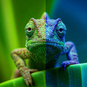
Color grading is the process of adjusting the colors in your photo to set a specific tone or mood. Unlike basic color correction, which balances whites, blacks, and exposure, color grading focuses on artistic choices. For example, you can make shadows blue for a cold look, or lift midtones with warm hues for a sunny feel.

Here’s a simple breakdown of the color grading controls in Lightroom:
| Control | What it Does | Tip |
| Hue | Changes the color tone of a specific range | Subtle changes work best |
| Saturation | Adjusts intensity of a color | Avoid oversaturation for realism |
| Luminance | Changes brightness of a color | Helps bring attention to key areas |
| Split Toning | Applies color to highlights and shadows separately | Great for cinematic effects |
Color grading is not about copying someone else’s style. It’s about adjusting your photo so it tells a story visually. Even small tweaks can make a huge difference.
Lightroom presets are like starting points. They apply a pre-defined set of adjustments, saving you the hassle of tweaking each slider manually. Start by browsing presets that match your desired style. Once applied, you can fine-tune hue, saturation, luminance, and tone curves to match your image.

For instance, a preset designed for urban photography might push teal in shadows and orange in highlights. If your photo has different lighting, you can adjust the saturation or temperature slightly to make it work. Think of presets as a shortcut, not a final answer.
“The magic is not in the preset itself, but in how you adapt it to your photo.”
A 2023 Zenfolio report found that 41% of photographers cited editing as the task they wanted to spend less time on. (Source)
Once you apply a preset, check the following:
These steps ensure your photos look professional and polished.

Not all presets work for every photo. Here are some general tips:
Experimenting with multiple presets helps you understand how colors affect mood. Over time, you’ll develop a sense of which adjustments enhance your personal style.
These steps can get your photos from flat to dynamic in just a few minutes.
Color grading in Lightroom with presets is not about copying someone else’s style. It’s about making creative choices that bring your vision to life. By experimenting, adjusting, and understanding your presets, you’ll start seeing real improvement in your edits.
Whether you’re editing landscapes, portraits, or urban shots, the right approach will make your work stand out.
Learn more about Presets and Lightroom:
Related Articles
Your thoughts and questions