Why is Color Important in Food Photography?
Silvain • updated June 20, 2022 • 3 min read
Silvain • updated June 20, 2022 • 3 min read

Different colors make us feel and act in different ways. So it’s important to know how the colors we use in our pictures help people relate to the story we’re telling.
Color in food photography is a part of visual design that we can use to make our pictures more interesting.
The colors of our food and recipes tell us a lot about how the food will taste and help us decide whether or not we want to make the recipe.
Colors do not just make things prettier. They give us a visual clue as to whether something is ripe or unripe, good or spoiled, and what flavor we can expect.
The rich, deep red of a strawberry leads us to hope for a sweet treat. Even before we take our first bite of a green tomato, we know that it is probably unripe and will taste neither sweet nor aromatic.
We can guess from the golden-browned crust how crispy and toasty a loaf it will be. It’s not for nothing that they say, “You eat with your eyes.”
“Colors do not only mean taste, colors direct our attention; they arouse expectations and emotions and are linked to trends and cultures.”
Content
In a two-dimensional medium like photography, without other sensory stimuli like smell, hearing, or taste, colors are one of the most important variables of all. That’s why you should pay special attention to them.
This starts with the selection of ingredients for your motif. For example, select only the most beautiful berries. Bright, rich colors tell us “there’s a flavor here.” Later, in image processing, it is also important to bring out these colors in a particularly beautiful way.
When choosing your backdrops and props, consciously pay attention to their colors and how they interact with the colors of your subject.
Do they, for example, support it through complementary contrasts, form a unity with the subject and thus a “round picture,” or even steal the show? Don’t be afraid to simply take a few test shots.
Your choice of backdrops and props should also always match your desired mood and style. Because here, you can create completely different worlds with your choice of colors.
For a spring-like scene, this can be deliberately soft, light colors in pastel. In summer, it can be a bright, colorful image composition, and in autumn and winter, it is rather dark and jewel-like.
It all depends on the story you personally want to tell with your photo and the mood the colors create in the viewer.
Color theory is a complex entity. For centuries, colors have fascinated both forward-thinkers and lateral thinkers. Different models and ways of looking at “color” have emerged.
From our point of view, for food photography, it is not necessary to penetrate into the last detail of color theory and to know all the models.
Therefore, we would like to introduce you to the most important color harmony models. This way, you will have additional tools at hand to consciously shape your images.
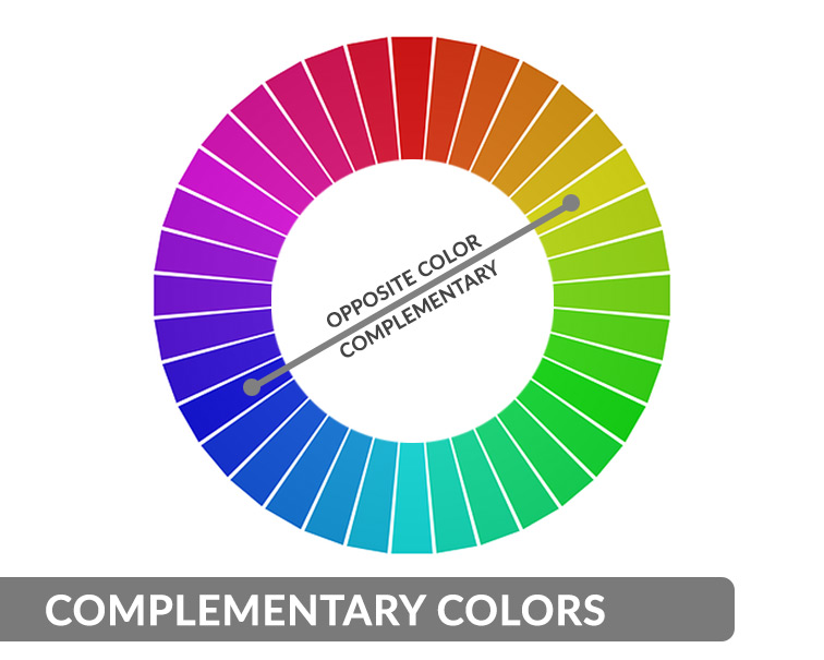
Let’s start with the complementary colors. They’re an absolute classic, and you’re probably familiar with the word. So what are complementary colors? They are exactly opposite each other on the color wheel.
With complementary colors, there are the pairs:
It helps a lot to know these pairs of colors. Because of their high contrast, they reinforce each other. You could almost say that they make each other glow.
If you’re unsure of which colors to combine, it’s a good idea to go for complementary colors. They almost always work!

Monochromatic means that exactly one color from the color wheel is integrated into the image. According to our observation, this effect is seen relatively rarely.
This is almost a bit of a shame, as it can create an incredibly impressive effect. Monochromatic images seem calm and, somehow, emotionally very stable.
On us, they sometimes exert a fascination that makes it difficult to tear oneself away from such images. In addition, in such images, it is possible to play wonderfully with brightness and saturation to achieve real variances.
Monochromatic images are easy to create because you don’t have to pay attention to whether the colors match. To create tension, the image composition, brightness, saturation, and also the play with shadows play an important role.

Analogous colors are adjacent to each other in the color wheel. They come from the same color field. In sum, they give you a little more variance than a purely monochromatic color scheme.
But the effect is similar. Here, too, the image is rather calmer and very harmonious. For clarification, we have a few pictures for you below.
Here you can see very nicely how red and orange tones harmonize with each other and complement each other. In sum, the picture lives or dies by its composition.
Because the abundance of ingredients is supported by similar and, at the same time, different colors.
The transition may be fluid for the viewer. But it’s important that you see what effect it can have.
If you want to bring a little more life into your image, but at the same time keep it “monochromatic,” then choose similar colors that are adjacent to each other in the color wheel from the same category. You can also get additional variance here by playing with light and darkness.
Since saturation and brightness are important. We mention it separately in this series, it is important to know. With all colors, you can play with both brightness and saturation.
It should be noted that saturation describes the gray tones and brightness of the levels between white and black. So if the color is maximally bright, it is white. If it is maximally dark, we speak of black.
Saturation, in turn, refers to the gray levels in a color. If you take saturation out of a color, it becomes “grayer,” so to speak.
To gradually give your images their own style, playing with saturation and brightness or darkness is a great tool. The best thing to do is to try it out in your image editing program.
See what effects the editing has in one direction or another, what you like, what suits you, and what you want to express.
More on Color Theory on Wikipedia.
Related Articles

Hotel Marketing

Real Estate Marketing

Real Estate Marketing

Real Estate Marketing
Your thoughts and questions