

Light & Airy Food Photography: How to Nail the Bright, Fresh Look Every Time
Michael • April 11, 2026 • 22 min read


Michael • April 11, 2026 • 22 min read
Content
If someone asks you what the opposite of dark and moody food photography looks like, the answer is sitting in your nearest café window. Check out Your Complete Guide to Food Photography if you want the full picture first – it covers every style, not just this one.
This article is specifically about the bright, clean, high-key approach that makes scrambled eggs look like a Sunday morning and a matcha latte look like it belongs on a wellness brand’s homepage.
You don’t need a studio. You don’t need expensive gear. What you do need is an understanding of how light behaves, how surfaces interact with it, and how to style a scene so everything works together. That’s exactly what this guide covers.
Light and airy food photography is a high-key style built on three things: soft, diffused natural light, a clean minimal palette, and intentional white space. When it works, it feels like 10 a.m. on a slow weekend.

When it doesn’t, it looks washed out and flat.
The mistake beginners make is chasing brightness instead of controlling light. Light and airy isn’t blown highlights – it’s soft light with dimension, where the subject stays the focus.
How it differs from dark and moody
Dark and moody relies on contrast, deep shadows, and rich tones. Light and airy is open, calm, and fresh. Instead of drama from shadows, you use negative space. Instead of heavy contrast, you work with soft gradients.
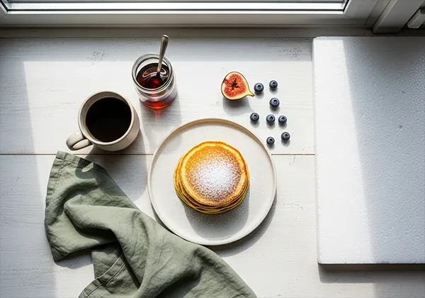
Same pancakes, different story:
Who uses this style
For these clients, it’s not optional. It’s the baseline.
What it’s not
The look lives in light quality and compositional restraint. Get those right, and the rest follows.
No softbox, ring light, or LED panel beats a window on an overcast day. I’ve shot in fully equipped studios and still moved everything closer to the window. That’s not nostalgia – it’s physics.
Window light is diffused, directional, and free. It wraps around food in a way artificial light rarely replicates without effort. But direction and timing matter.

North-facing vs. other directions
In the northern hemisphere, north-facing windows are ideal. They never get direct sun, which means soft, consistent light all day – crucial when shooting a series.
South-facing windows get direct sun most of the day. East gives strong morning light. West brings warm afternoon light. All can work, but they require more control – diffusion, tight timing, or repositioning as the light shifts.
The two-hour rule
On sunny days, direct window light creates harsh shadows. Your best window is about one hour after sunrise or one to two hours before sunset, when the sun is lower and softer.
On overcast days, you can shoot for hours. Clouds act as a giant diffuser, creating even, consistent light. If you’re planning a big shoot, hope for clouds.
Diffusing harsh light
When you can’t control the weather, control the window:
Keep a foam board on the shadow side of every bright setup. It costs a few dollars and saves you from fixing flat light in post.
The closer your subject is to the window, the softer and more wrapping the light. Move it three feet back and shadows get harder. For most brunch-style shots, keep your subject within two to four feet of the window.
Walk into any home goods store and count how many shades of “white” are on the shelf. Off-white, warm white, cool white, cream, ivory, chalk. They all look roughly the same in the store. On camera, under natural light, they behave completely differently.
Getting your background wrong is one of the fastest ways to make a well-lit shot feel off. The food looks right but something doesn’t sit. Nine times out of ten, it’s a surface conflict.

Warm whites have a slight yellow or cream undertone. They pair well with:
Cool whites have a blue or grey undertone. They work better with:
Mixing a warm white background with a cool white prop (or vice versa) creates a subtle visual tension that viewers notice without knowing why. Keep your whites consistent within the same color temperature.
| Surface Type | Light Behavior | Best Food Pairing |
| White marble | Reflects light, adds subtle pattern | Pastries, coffee, cheese boards |
| Linen/fabric | Absorbs light, soft texture | Rustic brunch, sourdough, eggs |
| Painted wood | Semi-reflective, warm or cool depending on paint | Pancakes, fruit bowls, granola |
| Ceramic tile | Hard reflection, clean lines | Smoothies, açaí bowls, clean café content |
| White foam board | Flat, even, no texture | Minimalist product shots, overhead flatlay |
Pure, stark white backgrounds look clean on screen but feel clinical in food photography. What you want is white with subtle texture or tone – something organic.
Think wrinkled white linen, marble with soft grey veining, or painted wood with visible grain. These imperfections add realism. Pure foam board works for product-style overheads, but rarely for lifestyle shots.
Test surfaces before shooting: place them near your window and take a quick photo. You’ll immediately see if the undertone complements your food and props.
One surface alone is rarely enough. Layering a linen cloth partially under a ceramic plate on a marble surface adds depth without adding visual noise. The key is keeping the color temperatures consistent and limiting yourself to two surfaces maximum in any one scene.
Color is where light and airy photography either comes together or falls apart. A lot of people assume “bright and clean” means “use white everything.” It doesn’t. A scene with zero color variation looks sterile. The goal is controlled color, not absent color.

Interior designers use this rule constantly, and it translates directly to food styling:
For a brunch flat lay, this might look like: white marble base (60%), sage green linen napkin and plates (30%), a few raspberries or a slice of orange as the accent (10%). The result feels intentional without looking designed.
Complementary palettes use colors opposite each other on the color wheel. They create energy and contrast:
Analogous palettes use colors that sit next to each other on the wheel. They create harmony and calm:
For light and airy content targeting wellness and café brands, analogous palettes tend to perform better. They feel cohesive and effortless rather than punchy.
Brands that do this well shift their palette with the season. Spring and summer lean into greens, whites, and soft pinks. Autumn brings amber, terracotta, and warm cream. Winter moves toward cool grey, white, and deep green.
When building a café content library, plan seasonal palettes intentionally instead of reusing the same props year-round. It keeps the feed current without a full restyle each time.
Everyone talks about light sources. Fewer talk about shaping the light once it’s in the room. That’s where reflectors and fill cards make or break a bright, clean shot.
In moody food photography, shadows add drama. In light and airy work, they’re uninvited guests. You don’t remove them – you soften and control them.

A fill card bounces existing window light back into the shadow side. It doesn’t add light; it redirects it. The result is a soft gradient instead of a heavy dark side, essential for a fresh, brunch-style look.
Skip silver reflectors. They create cool, concentrated hot spots and make glossy food look artificial – the “chrome problem.”
What works:
White foam board extends window light without fighting it.
Place your subject 2–3 feet from the window. Put white foam board on the opposite side, angled slightly toward the light. Close enough to lift shadows, far enough to avoid creating a second light direction.
The goal: no obvious bounce, no flatness – just a natural transition from light to softer shadow. The fill should be invisible.
Distance guidelines
Angle the board about 45° toward the window. Too flat reflects harshly; too far angled loses the bounce.
In food photography, people obsess over bodies and lenses. But your settings determine whether your light works – or falls apart.
The sweet spot is f/2.8 to f/5.6.
Avoid shooting wide open at f/1.4–f/1.8 unless you want a very shallow editorial look. Too little in focus can make food look unappetizing.
Meters aim for mid-tones. In bright, white scenes, they underexpose by trying to turn white into grey. Check your histogram – push data right, but don’t clip.
For client work or tethered shoots, use a grey card in the first frame, set custom WB, and lock it.
Good light on set cuts your editing time by more than half. The edit for a well-lit bright setup should take ten to fifteen minutes, not an hour. If you’re spending longer than that, something wasn’t right at the shoot stage.
That said, editing is where you finish the look. It’s the difference between a bright photo and a cohesive, polished image that feels like a specific style.

You don’t need to touch every panel in Lightroom to nail this look. Start with these four:
The tone curve is where the two styles split most clearly.
For dark and moody food photography, the curve is an S-shape with a pulled-down shadow point, creating deep blacks and strong contrast.
For light and airy, lift the shadow point up slightly (drag the bottom-left anchor point upward). This creates a “faded” base that prevents the shadows from going pure black. The result is an airy, open feeling even in the darker parts of the frame. Pair this with a slightly compressed highlight end and you get a soft, film-like quality.
The biggest trap in light and airy editing is over-brightening to the point where food loses its appetite appeal. A strawberry shouldn’t look pink. Egg yolks shouldn’t look white. Green herbs shouldn’t go neon.
Use the HSL panel to manage individual colors:
A good preset gets you 70 to 80% of the way there in one click. The remaining 20 to 30% is always a manual adjustment for the specific image: the light quality that day, the surface color, the food tones.
The Food Preset Collection for Lightroom is built specifically for food photography across both bright and moody styles. The light and airy presets in the collection are calibrated for natural window light, so they work with the physics of what you’re doing on set rather than fighting it.
Use presets as a starting point, not a finish line.
In the Color Grading panel, a small warm push in the midtones (+3 to +5 on the orange/yellow axis) gives the image a slightly organic, inviting quality without going full “golden hour.” Keep shadows neutral or very slightly cool. This creates a gentle contrast between warm midtones and cool shadows that feels natural rather than filtered.
Last spring, I shot a full content library for a café rebranding around a “slow morning” concept. They had dark, yellow kitchen-light photos and wanted something clean and calm.
We shot everything within four feet of a north-facing window. No artificial light. No studio. Just a corner of the dining room.
I limited props to their brand colors: white, warm cream, soft sage. Nothing else. Every item had to earn its place.
Total spend: under $60, mostly secondhand ceramics.
We started with one strong hero flat lay: breakfast bowl, jug, folded linen, thyme. White base. Foam board fill.
Then we created variations by adjusting, not rebuilding.
Five shots. One setup. Three hours. A month of content.
Leave 30–40% of the frame open. Empty space gives the eye a place to rest – and room for text or branding. Shoot based on usage: Instagram needs different framing than a website banner.
You can have the right window and props and still miss the shot. Usually, it’s a few small, fixable errors.
Light and airy food photography is a discipline built on restraint. The right window. A surface that doesn’t fight your light. A color palette that stays in its lane. Settings that support what you built on set. An edit that finishes the work without overdoing it.
None of this requires expensive equipment or a dedicated studio. It requires understanding how natural light behaves and making deliberate choices at every stage of the process.
Start with one north-facing window, one white surface, and one well-chosen subject. Get that right before you add anything else.
When you’re ready to speed up your post-processing workflow without losing consistency, the Food Preset Collection for Lightroom is built specifically for natural light food photography. It’s the fastest way to apply a polished, cohesive look across an entire shoot.
Yes – but you’ll work harder. Small windows create narrower, more directional light, so move your subject close and use white foam board to fill shadows. On overcast days, size matters less because the sky acts as a giant diffuser. No window? Use a large daylight-balanced LED (5500K), diffused to mimic window light.
Three things: light direction, shadows, and color palette. Moody uses hard side/back light, deep shadows, rich tones. Airy uses soft front/side light, minimal shadows, clean or vibrant colors. Neither is better – they serve different brands and foods. Lava cake suits moody. Smoothie bowls suit airy.
No. A window is your main tool. Add a RAW-capable camera (even a smartphone), a $2 foam board, and a clean white surface – that’s 80% of it. A 50mm f/1.8 ($100–150) is more than enough for most café content. Gear improves workflow, not light understanding.
If they’re grey in-camera, you’re underexposed – use +0.3 to +0.7 EV and check the histogram.
If they’re grey in edit, warm WB to 5000–5500K. In Lightroom, push Whites +20 to +40 for brightness without clipping.
Overcast days: anytime.
Sunny days:
If possible, schedule for an overcast morning – longest stretch of soft, workable light.