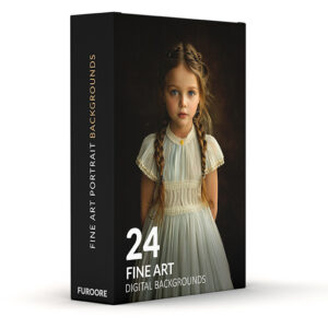
The Ultimate Guide to Food Photography: Everything You Need to Know About Styling, Lighting & Editing.

Michael • April 7, 2026 • 60 min read

45 degree angle food photography of a styled brunch spread on a wooden table

You need more than a fancy camera to take pictures of food that looks as good as it tastes. It takes skill with light, texture, and composition. This definitive masterclass breaks down professional food photography, from advanced styling tips and restaurant lighting setups to the exact Lightroom workflows that make high-end, mouth-watering pictures.


 Key Takeaways 

  • Food photography is about creating desire, not recording a meal. The gap between a snapshot and a professional shot is mostly lighting and intention, not gear.
  • A crop sensor camera with good glass beats a full-frame body with a kit lens every single time.
  • You only need three lenses to cover 95% of food work: a 50mm, a 100mm macro, and a 35mm.
  • Tethering to a laptop during a shoot is not optional at the professional level. It catches focus and exposure problems in real time.
  • Natural-looking edits retain viewer trust. Heavy filters are the fastest way to make food look inedible.

What Is Food Photography?

Food photography is the practice of capturing still or moving images of food and drink for commercial, editorial, or social media use. It combines lighting, composition, food styling, and post-processing to make food look as appealing as possible.

The goal is not to document what a dish looks like, but to trigger a physical desire to eat it. Professional food photographers work with stylists, art directors, and clients across restaurants, cookbooks, advertising, and packaged goods.

 PART 1 

1. The Psychology of the “Perfect Plate”

Food photography is the single most effective form of visual marketing that exists right now. That is not an opinion. A study by Grubdata found that menu items with a professional photo outsell unillustrated items by up to 70%. Instagram alone processes over 400 million food-related posts per year. The appetite is real, and so is the money.

But here is the thing most people get wrong when they start out: they treat their camera like a witness. They point it at a plate and press the button. What you get is a document, not an image. There is a hard difference between the two.

The “first bite” is always with the eyes. This is not a metaphor. The cephalic phase response is a documented physiological reaction: the sight or smell of food triggers saliva, insulin, and gastric acid production before a single bite is taken. When your image triggers that response in a viewer, you have done your job. When it does not, no amount of clever hashtags will save you.

The shift from “documenting dinner” to “creating an appetite” is a mental one more than a technical one. You are not photographing food. You are photographing the experience of eating it. The warmth of fresh bread. The cold shock of a cocktail glass. The way steam lifts off a bowl of ramen. Your job is to translate those physical sensations into a flat image.

PRO Tip: While mastering manual editing is a vital skill, you can achieve a professional, appetizing look instantly by using our signature Food Presets for Lightroom. These tools are designed to correct common restaurant lighting issues while enhancing the natural textures and colors of your dishes.

The Furoore Philosophy: Clean Beats Heavy

One trend that has quietly killed a lot of otherwise good food photography is the over-reliance on heavy presets and artificial filters. The orange-teal look. The extreme desaturated matte. The crushed blacks with a green tint. These filters were borrowed from fashion and landscape photography, where they can work brilliantly. On food, they are close to disastrous.

Here is why. The human brain is remarkably good at detecting when food looks “off.” We have been visually evaluating food for survival for a very long time. When meat goes grey, when greens turn yellow, when highlights blow out on a glaze, your brain registers it as spoiled or unappetizing, even if you cannot consciously articulate why.

The Furoore editing philosophy is built around one principle: make food look like the best version of what it actually is. That means correct white balance, controlled highlights, boosted mid-tone clarity, and targeted color work in HSL. No heavy-handed color grading. No artificial grain. No crushed shadows that hide the texture of a dish.

Clean, naturalistic editing builds trust with a viewer. It makes the food look real, which is exactly what triggers the desire to eat it.

Personal note

I spent about two years chasing the “cinematic” look on food. Learned the hard way that the images my clients responded to were always the cleaner ones. The moody stuff got likes. The clean stuff got repeat bookings.

 PART 2 

2. The Food Photographer’s Toolkit

Let’s talk gear. Not in a gear-obsession way, but practically: what you actually need, what is a waste of money early on, and why certain choices matter more than others in the specific context of food.

Food photography camera gear including 50mm, 100mm macro, and 35mm lenses on slate
The three lenses that cover 95% of professional food work. Left to right: 35mm, 50mm, 100mm macro.

Camera Systems: Full-Frame vs. Crop Sensor

The full-frame vs. crop sensor debate is louder than it needs to be. For food photography, here is the short version:

Dynamic range matters. A lot. Highlights on glossy food surfaces, like a honey glaze, a chocolate drizzle, or a soup surface, blow out fast. Full-frame sensors from Sony (A7 series), Nikon (Z series), and Canon (R series) recover 1.5 to 2 stops more highlight detail in post than most crop-sensor bodies. That extra recovery headroom is genuinely useful when you are shooting a backlit bowl of fruit and trying to keep both the shadow detail and the highlight texture.

That said: a crop-sensor camera with great glass will outperform a full-frame camera with a mediocre lens. The Sony A6700, the Fujifilm X-T5, the Canon R10 are all capable of professional food work. The Fuji X series in particular has color science that food photographers love for its rendering of warm tones and greens.

Feature Full-Frame Crop Sensor (APS-C)
Dynamic range (typical) 13–15 EV 11–13 EV
Low-light ISO performance Superior Acceptable
Lens cost Higher Lower
Body weight Heavier More compact
Entry-level body price $2,000–$3,500 $800–$1,500

The bottom line: if you are starting out, buy the best lens you can afford and use whatever body you already have. Upgrade the body when your work outgrows it.

The Holy Trinity of Food Lenses

You do not need ten lenses. You need three. These three cover everything from a tight macro shot of a crumb to a full table spread.

The 50mm: The All-Rounder

The 50mm (or 35mm equivalent on crop sensor) is your bread-and-butter lens for food. It renders perspective close to how the human eye sees a table, which makes images feel natural rather than distorted.

A 50mm f/1.8 from Canon or Nikon costs around $100–$150 used, and it is one of the best investments in food photography. Use it for hero shots at 45-degree angle, plated dishes, and any mid-distance work where you want to include some context around the food.

The 100mm Macro: The Detail King

This is the lens that sells food. The Canon 100mm f/2.8L Macro and the Nikon 105mm f/2.8G Macro are workhorses that every serious food photographer eventually owns. The macro capability lets you fill the frame with a raspberry, a cross-section of bread, or the steam venting off a coffee cup.

The longer focal length also compresses background elements, giving you a cleaner, less distracting image even when your shooting space is cluttered. Expect to pay $500–$900 used for the Canon L version.

The 35mm: The Tablescape Storyteller

When you need to show the full scene, the 35mm is what you reach for. A farm-to-table spread, a brunch setup with props, a full restaurant table. The 35mm gives you a slightly wider field of view than the 50mm without the distortion of an ultra-wide lens.

On a full-frame body, it lets you work closer to the table in tight shooting spaces, which is useful in restaurant environments. The Sigma 35mm f/1.4 Art is a strong option at around $400 used.

Essential Modifiers: Scrims, Bounce Cards, and Diffusers

Gear beyond the camera that most beginners skip, and then regret skipping:

  • Scrims are translucent panels (usually 1-stop or 2-stop diffusion fabric) that you place between a light source and your food. If you shoot near a window in harsh midday sun, a scrim turns that hard, shadow-heavy light into something soft and even. A basic 42-inch 5-in-1 reflector kit from Neewer or Godox ($30–$50) includes a diffusion panel that works as a scrim.
  • Bounce cards are flat reflective surfaces used to fill shadows on the opposite side of your light source. White bounce cards give a soft, neutral fill. Black bounce cards (also called flags or negative fill) do the opposite: they absorb light and deepen shadows, which is useful when you want to add drama or separation to a shot. Both are essential. You can make them from foam board for next to nothing.
  • Diffusers (when attached to strobes or speedlights) soften the quality of artificial light to mimic the behavior of large, indirect light sources. A large softbox in the 60x90cm range is the standard starting point for studio food work.

Tethering: Why the Laptop Screen Is Non-Negotiable

Tethering means connecting your camera to a laptop via USB and using software (Canon’s EOS Utility, Nikon’s Camera Control Pro, or third-party options like Capture One or Lightroom) to view each shot full-size on screen as you take it.

Here is why this matters:

A 3-inch LCD on the back of a camera will lie to you. You will think a shot is sharp, get back to your desk, zoom in on a monitor, and discover the focus landed on the back of the plate instead of the front. You will think the exposure is correct, and then see that the highlights on the sauce are completely gone. This happens to experienced photographers constantly when they shoot without tethering.

On a 15-inch laptop screen at 100% zoom, you see the actual image. You catch focus problems immediately and re-shoot on the spot, while the food still looks good. You catch exposure errors before the client is watching the hero shot fall apart in post.

For restaurant and commercial shoots, tethering is a professional requirement, not a nice-to-have. Clients and art directors expect to see the images during the shoot. Capture One (around $24/month) has the most responsive tethering pipeline of any software currently available, with near-instant image transfer and a flexible culling interface.

Get a quality tethering cable with a locking connector. The Tether Tools Case Relay cable system ($50–$80) prevents accidental disconnections and is worth every cent.


Discover our Advanced Food Photography Techniques:


 PART 3 

3. Mastering Light: The Secret to “Delicious” Pixels

Light is the single variable that separates a food photo that makes someone stop scrolling from one that gets ignored. Gear helps. Styling helps. But if the light is wrong, nothing else can save the shot.

Side by side comparison of soft and hard lighting on a bowl of ramen in food photography
Same bowl, same angle, different light modifiers. The softbox version (left) reads as comforting and clean. The bare strobe version (right) is dramatic and high-contrast. Neither is wrong; they serve different briefs.

Good news: food photography does not require complex multi-light setups. Most of the best food images ever made were lit with one light source. The skill is knowing where to put it and how to shape it.

Directional Theory: The 10 O’Clock and 2 O’Clock Rule

Imagine your food is sitting in the center of a clock face, and you are looking down at it from above. Your camera is positioned at 6 o’clock, pointed toward 12. The two positions that consistently produce the most appealing food lighting are 10 o’clock (front-left) and 2 o’clock (front-right).

Here is why these positions work so well. Light coming from either of these angles creates:

  • Side-rim definition on the edges of the food, which reads as texture
  • Gentle shadows that move across the surface of the plate, giving the food a three-dimensional quality
  • No direct front-flash effect, which flattens food and destroys texture

Straight backlight (12 o’clock) is dramatic and works beautifully for translucent subjects like cocktails, soups, and anything with a glaze that you want to glow. But it is harder to control and requires more flagging to avoid lens flare.

Front light (6 o’clock, coming from behind your camera) is almost always a mistake in food photography. It produces flat, shadowless images that make food look like it was photographed under a hospital ceiling. Avoid it.

The 10 and 2 positions are the safe starting points. From there, you adjust based on the shape of the food and what you want to show. A tall stack of pancakes might benefit from light pushed slightly further back toward 11 o’clock to skim across the layers. A flat pizza needs light kept closer to 9 or 3 to create enough shadow variation to show the toppings.

Artificial Light Mastery: Mimicking Window Light with One Strobe

Natural window light is beautiful, but it is also inconsistent. It changes by the hour, by season, and by cloud cover. The moment you start taking commercial work seriously, you need to be able to reproduce your results on demand. That means artificial light.

The good news is you do not need a full studio rig. A single monolight or speedlight with a large softbox (at minimum 60x90cm, ideally 80x120cm) placed at the 10 o’clock position will produce window-quality light on demand, any time of day, in any location.

  • Why large matters: The size of a light source relative to the subject determines the softness of the light and the quality of the shadows. A large softbox placed close to your food behaves like a big window. It wraps the light around the subject and produces soft, gradual shadow transitions. A small softbox or bare speedlight at the same distance produces hard, harsh shadows and unflattering specular highlights on any reflective surface.
  • Distance matters too. Move the softbox closer to the food and the light gets softer and falls off faster (meaning the background goes darker relative to the subject). Move it further away and the light gets harder and more even across the scene. For most food setups, a 60x90cm softbox positioned 60–80cm from the subject at 10 o’clock is the starting point.

For a complete one-light setup:

  • Monolight: Godox AD300 Pro ($250–$300) or the Profoto B10 if budget allows ($1,500)
  • Softbox: 60x90cm or 80x120cm with a grid to control spill
  • Stand: A sturdy C-stand rated for at least 3kg
  • Trigger: Godox X2T wireless trigger ($35)

Pair the softbox with a white bounce card on the opposite side (the shadow side) to add a soft fill and control how dark the shadows get. That is your entire starting kit. Most professional food images are made with exactly this setup.

Managing Reflections: The Difficult Surfaces

Some surfaces are a pain. Here is how to handle the most common ones.

Soup and liquid surfaces act like mirrors. Any light source above the bowl will reflect directly back into the camera as a hot spot. The fix is to light from the side or from behind, never from above, and use a flag (a black card) between the light and the bowl to block any overhead spill. A polarizing filter on your lens can reduce surface reflections further, though it costs you 1.5 stops of light.

Oily glazes (think roast chicken skin, teriyaki, or lacquered ribs) are actually easier to deal with than most people think. The specular highlights on a glaze are what make it look delicious.

The goal is not to eliminate them but to control their shape. A grid on your softbox concentrates the light and prevents the highlight from spreading into a formless blob. Position the light so the highlight sits on the edge of the food facing the camera, not on the top surface.

Shiny cutlery is one of the most consistent headaches in food photography. A fork or spoon will pick up reflections of the room, the softbox, and sometimes the photographer. The fastest fix: dulling spray (Krylon Make It Matte, around $8 a can) kills reflections instantly and wipes off clean.

For shoots where you cannot use spray, position the cutlery so its reflective face angles away from the camera, and use a black flag to control what reflects in the blade.

Hard Light vs. Soft Light: Matching Light Quality to Food Type

Not all food wants the same light. This is one of the less-discussed but more practical areas of food lighting.

Soft light (large light source, close to subject) is the default for most food: pastries, bread, pasta, salads, cheese boards, eggs. It is flattering, it preserves color accuracy, and it makes food look approachable. If you are shooting a bakery’s hero product line, soft morning-style light is almost always the right call. The shadows are gentle, the textures read clearly, and the image feels warm and inviting.

Hard light (small light source, or a large source moved far away) introduces contrast, strong shadows, and a dramatic quality that works well for specific subjects. Dark cocktails with ice, espresso shots, charred meat, aged whiskey.

The high-contrast look gives these subjects an edge that soft light cannot. Think about the difference between a soft window-lit croissant and a dramatically lit glass of bourbon with a single hard shadow crossing the table. Both are correct for their subjects.

A practical test: if the food is something your grandmother might make for Sunday brunch, start with soft light. If it is something served in a dimly-lit bar or a high-end steakhouse, try hard light first.

Food Type Light Quality Position Modifier
Bread, pastry, eggs Soft 10 o’clock Large softbox, white bounce fill
Dark cocktails, spirits Hard 2 o’clock backlit Small softbox or gridded strobe
Salads, fresh produce Soft 10 o’clock Scrim over window or softbox
Glazed/charred meat Semi-hard 10–11 o’clock Medium softbox with grid
Soups and broths Soft backlight 12 o’clock Scrim, flag overhead

 PART 4 

4. The Art of Food Styling

This is where most people’s food photography actually breaks down. Not the camera. Not the lens. The plate looks wrong and they do not know why.

Food styling is a skill in its own right. On big commercial shoots, the stylist and the photographer are two different people. When you are working solo, you are both. Here is what professionals actually do to make food look the way it does in magazines and on restaurant websites.

Food photography styling kit including glycerin spray, toothpicks, steamer and tweezers on dark wood
The tools behind the image. Most of these cost less than $50 total and get used on every professional food shoot.

The “Hero” vs. The “Stand-In”: Managing the Death Clock

Every dish has a lifespan in front of a camera. Lettuce wilts. Ice melts. Sauce bleeds. Bread goes stiff. This is what stylists call the death clock, and managing it is one of the core skills of the job.

The professional approach: never set up your lighting or test your composition on the actual hero dish. Instead, build a stand-in, which is a rough version of the dish made from cheaper or less perfect ingredients, used purely to dial in your exposure, focus, and composition.

It can be a plated version of yesterday’s leftovers. It can be a dummy burger made from a hockey-puck piece of beef. It does not matter what it looks like, because you will never photograph it.

Once your lighting is locked, your composition is confirmed, and your camera settings are dialed in, you call for the hero. The hero is the best, freshest version of the dish, prepared at the last possible moment. From the time the hero hits the table to the time you take the final shot, your goal is under five minutes. Some experienced stylists work to a three-minute window on difficult dishes.

Know which elements of your dish die fastest and plate them last. The crispy element goes on after the sauce. The fresh herb garnish goes on last of all. The ice cream scoop is the very last thing that happens before you pick up the camera.

The Stylist’s Secret Kit

What you see in a professional food image is almost never exactly what it appears to be. This is not deception for its own sake. It is the practical reality that cameras see food differently than human eyes do, and some adjustments are needed to close that gap.

Glycerin and Water: The Fresh Spritz

Freshly cut herbs, vegetables, and fruit look vibrant for about ninety seconds before they start to oxidize and dry out. A food-grade glycerin and water mixture (roughly 1 part glycerin to 3 parts water in a fine-mist spray bottle) coats the surface of produce in tiny droplets that do not evaporate quickly. The result is that “just washed” look that screams fresh. Use sparingly, a light mist is enough. Over-spritz and you get a soup instead of a salad.

Glycerin is available at any pharmacy or baking supply store for about $5. It is one of the highest return-on-investment items in the entire kit.

Motor Oil vs. Maple Syrup: The Transparency Debate

You have definitely seen this one discussed online. Pancake ads in the 1980s and 1990s famously used motor oil in place of maple syrup because real maple syrup is too dark and opaque on camera. Under hot studio lights, it also tended to sink into the pancakes fast, leaving a dry, unglazed surface.

Here is the current reality: most professional food photographers working today use real maple syrup, but they apply it right before the final hero shot and only on the top surface. The issue was primarily a television commercial problem, where lights were much hotter and sessions lasted hours. In still photography, real syrup works fine if your timing is right.

Where the substitution still happens: dark liquids on transparent or semi-transparent surfaces. A chocolate sauce in a clear glass jar, for example, often gets substituted with a thicker, darker substance (sometimes thinned acrylic paint in photography tests) because real chocolate sauce separates and loses its color on camera.

For actual commercial food work, check your client’s legal requirements first. Many brands, especially in North America, require that photographed food be the actual product.

Cardboard Spacers and Toothpicks: The Gravity-Defying Burger

The burger is one of the most technically difficult food photography subjects because it fights gravity constantly. Ingredients slide, the bun compresses the stack, the cheese melts unevenly, and the whole thing loses about 30% of its height the second it is assembled.

The classic solution: cardboard spacers cut to match the height of each layer, placed inside the burger where they will not be visible from the camera’s angle. Combined with toothpicks driven vertically through the stack to hold each layer in position, this keeps the burger at its full assembled height indefinitely. You pull the toothpicks and card just before the hero shot, or in some cases they remain in place and are removed in post.

Some stylists also use a small kitchen torch on the outside of burger patties to add color and grill marks to meat that was cooked under-temperature to prevent shrinkage. The inside stays raw, but on camera, you see the exterior char.

The Steamer: Reviving Meat and Vegetables

Cooked meat turns grey within minutes at room temperature. Vegetables lose their bright green color as chlorophyll breaks down with heat. Both are death for a food image.

A handheld garment steamer (the kind you would use to de-wrinkle a shirt) is a professional food stylist’s most-used tool. A short burst of steam, two to three seconds across the surface of a piece of cooked chicken or a roasted vegetable, instantly revives color and adds a slight moisture sheen that reads as fresh-cooked. It also perks up wilting herbs and adds life to limp garnishes.

Buy a compact travel steamer for about $25–$35. It takes up less room than a can of dulling spray and gets used on nearly every shoot.

Plating Fundamentals: The Visual Rules That Actually Work

Negative space is the area of the plate or frame that contains nothing. Most beginners fill every millimeter of the plate and every corner of the frame. Professionals leave deliberate empty space, because empty space is what makes the eye go to the food. A plate that is 60% food and 40% empty reads as considered and elegant. A plate that is 100% food reads as crowded.

The S-Curve is a compositional technique borrowed from landscape photography. You arrange elements in the frame so the eye traces a loose S shape from one corner to another, moving across the food before landing on the hero ingredient. In practice: a sprig of herb at the back left, a sauce smear angling from center to right, the hero ingredient at the front center, a scatter of garnish at the bottom left. The eye travels the S without the viewer knowing it.

Color theory on the plate comes down to one practical rule: complementary colors create appetite. Orange and blue. Red and green. Yellow and purple. The most powerful combination in food photography is orange-red protein (steak, salmon, roasted chicken) against a green element (herb oil, fresh basil, charred broccolini). Your brain reads this combination as nutritionally varied and appealing. It is not an accident that most restaurant plates default to some version of it.

A second color rule: limit your plate to three colors maximum. More than three and the image reads as chaotic. Two works well. Three is the ceiling.

Personal note

The S-curve thing sounds like art school theory until the first time you consciously apply it to a shot and compare it to your previous attempts. The difference is immediately visible. It is one of those things that once you see it, you cannot unsee it.

 PART 5 

5. Composition: Geometry on a Table

Composition is the one area of food photography where knowing the rules actually makes you faster, not more rigid. Once these angles and principles are in your muscle memory, you stop second-guessing your setup and start making decisions in seconds.

food photography angle using a bowl of ramen: 45 degree
The 45-degree shows the full bowl.

The 3 Essential Angles

There are three camera angles that cover the full range of food photography. Every other angle is a variation of one of these three.


1. The Overhead (90 Degrees): The Big Spread

The camera is directly above the food, pointed straight down. This is the most architectural of the three angles. It turns a table into a flat design, which is why it works so well for spreads, flat foods, and anything where the arrangement of elements tells the story.

Best uses: grain bowls, flatbreads, charcuterie boards, breakfast spreads, sushi platters, and any dish where the top surface is the most interesting part.

Where it fails: tall food. Stack a burger or pour a latte and shoot it from directly above, and you lose all the height information that makes those subjects appealing. A burger shot from 90 degrees looks like a bun. That is it.

Practical tip: shoot overhead on a table rather than from a ladder. Lower your tripod arm to extend horizontally over the food, or use an overhead arm attachment. Keep your camera level with a bubble level or in-camera horizon display, even a 2-degree tilt is immediately visible from this angle.


2. The Hero Angle (0 Degrees): Eye Level

Camera is level with the food, shooting straight across the table. This is the angle that makes tall food look tall. Pancake stacks, layered burgers, towering milkshakes, layer cakes. The hero angle lets you show every layer in a stack and gives the food a sense of scale and height that no other angle produces.

It is also the most dramatic angle for liquids being poured and for shots where you want the food to feel imposing and larger than life.

Where it fails: flat foods and spreads. A bowl of soup shot at 0 degrees shows you mostly the side of the bowl and a thin strip of liquid at the top. Nothing about that image communicates what is in the bowl.


3. The Diner’s View (45 Degrees): The Default

This is the angle you actually see food from when you sit down to eat. Camera positioned at roughly table height but angled slightly downward, giving you a clear view of both the top surface of the food and its height. It is the most naturally relatable perspective and the one that works for the widest range of dishes.

For most food photography situations, 45 degrees is your starting point. If the dish is tall, push the angle closer to 0. If the dish is flat or a spread, push it toward 90. The 45-degree angle is home base.

Lens Compression: How Focal Length Changes the Story

This is one of the less-discussed but more practical aspects of lens choice in food photography.

  • A 35mm lens used close to the food produces noticeable background distortion: objects close to the camera look large, objects farther away recede quickly. This gives a sense of depth but can make backgrounds look cluttered or chaotic.
  • A 100mm lens used further from the food compresses the relationship between the subject and the background. The background elements look larger relative to the food, the depth of field is shallower at the same aperture, and the overall image has a cleaner, more refined quality. This is why the 100mm macro is so widely used for hero product shots: it isolates the food cleanly without requiring a completely blank background.

Practical test: place your food on a set with textured background props. Shoot the same composition at 35mm, 50mm, and 100mm, adjusting your camera position each time to keep the food the same size in frame. The 100mm version will look notably more polished, with the background rendered as soft, non-distracting shapes rather than identifiable objects.

Leading Lines: Directing the Eye Without Effort

Leading lines are compositional elements that physically guide the viewer’s eye toward the subject. In food photography, the most common leading lines are:

  • Cutlery angled across the frame toward the hero dish
  • A sauce smear or drizzle that starts at the edge of frame and ends at the food
  • A folded napkin or piece of linen that runs from a corner toward the plate
  • Scattered ingredients (pine nuts, herbs, spice) arranged in a line that points at the main subject

The principle: the eye follows lines. If every line in your frame converges on the food, the viewer’s attention lands exactly where you want it. If lines point away from the food or create competing directions, the image feels unsettled and the viewer’s eye wanders.

One rule worth following: no accidental lines. Before you shoot, look at every element in the frame and ask where it is pointing. Reposition anything that pulls the eye away from the hero.

 PART 6 

6. Environmental Styling and Props

The food is the subject. Everything around it is the context. Context either supports the story you are telling or competes with it. There is no neutral ground in a frame.

Chocolate sauce being poured over a vanilla panna cotta on a white marble surface in food photography
The pour shot is one of the most consistently high-performing food image formats. Freeze the motion at 1/800s or faster for a clean, non-blurred stream.

Choosing the Background: Wood, Marble, or Slate?

Background surfaces do more work in a food image than most people realize. They set the mood before the viewer even consciously looks at the food.

  • Wood is warm, rustic, and human. It suggests home cooking, farmers markets, and handmade food. It works across a wide range of dishes but is especially effective for bread, charcuterie, cheese, and anything with a farm-to-table positioning. Dark wood reads as more refined and dramatic. Light wood reads as Scandinavian, minimal, and fresh.
  • Marble signals premium. It is the background of patisseries, high-end cocktail bars, and fine dining. White marble with grey veining works for almost any light-colored food. Black marble is harder to use but effective for dark spirits, chocolate desserts, and anything where you want maximum contrast.
  • Slate is cool, contemporary, and slightly industrial. It works well for cheese, seafood, charcuterie, and modernist plating styles. It absorbs light rather than reflecting it, which reduces background hotspots and makes it easier to light than marble.
  • Linen and fabric are underused by beginners and overused by people who have just discovered them. A piece of rumpled linen under a plate adds texture and warmth. Too much fabric in the frame starts to look like a lifestyle catalog rather than a food image. Use it as a supporting element, not a statement.

The rule on backgrounds: the background should have a texture and tone that complements the food without competing with it. A bright yellow curry on a yellow wooden background disappears. The same curry on a dark slate or black marble pops immediately.

The Human Element: Hands, Pours, and Bites

The fastest way to add life to a static food image is to introduce a human element. Food exists to be eaten, handled, and shared. When a frame includes evidence of a human being, the viewer instinctively projects themselves into the scene.

Hands are the most commonly used human element in food photography. A hand reaching for a slice of pizza, holding a taco, or wrapping around a coffee cup transforms the image from a product shot into a moment. A few practical points:

  • Use hands with clean, well-maintained nails. Chipped nail polish or rough cuticles will pull focus.
  • Keep skin tones natural. Heavy artificial light on hands looks clinical. Use the same soft light as your food.
  • The hand should look relaxed and natural, not posed. Tense, splayed fingers read as awkward.

The pour is one of the highest-engagement food photography formats across all platforms. Sauce being poured over a dish, syrup hitting pancakes, cream being added to coffee. The motion (even frozen in a still image) creates visual energy that static shots lack. To shoot a clean pour, you need a fast shutter speed (at minimum 1/500s, preferably 1/800s or faster) and a shooter’s assistant handling the pour while you focus and time the shot.

The bite is more challenging but extremely effective. A piece of cake with a fork mid-press, a burger with a cross-section visible from a bite taken from the front. These techniques show the inside of the food, which is often more appetizing than the exterior. The cross-section burger shot is genuinely one of the most effective formats for communicating a burger’s construction and quality.

Storytelling With Crumbs: Intentional Mess

Clean and perfect looks corporate. A little mess looks real.

This is a technique that separates images with personality from images that feel sterile. Scattered crumbs around a loaf of bread. A smear of sauce on the edge of the plate. A dusting of flour on a wooden surface near a pastry. A half-drunk glass of wine next to a cheese board.

None of this is accidental. Every element of the “mess” is placed deliberately and reviewed in the frame before shooting. The goal is to make the scene look like someone was just here, eating, enjoying, living. That narrative quality makes a viewer feel something, and feeling something is what drives engagement and sharing.

The practical limit: one layer of mess maximum. Crumbs and a sauce smear. Not crumbs and a sauce smear and a used napkin and a scattered fork and a partially eaten second portion. One deliberate imperfection reads as authentic. Four reads as a garbage scene.

A useful exercise: after you have styled your shot completely, step back and look at it. If it looks like a catalog image in a store that no human has ever touched, add one element of intentional mess and reshoot.

 PART 7 

7. Post-Processing: The Furoore Editing Workflow

Getting the image right in camera is the goal. Post-processing is where you finish the job, not where you fix fundamental problems. That said, even a perfectly exposed and lit image needs editing work before it is ready for client delivery or publication.

Before and after food photography editing comparison showing salmon fillet with Furoore preset applied
Left: the raw file straight from camera with warm restaurant yellow cast. Right: after white balance correction, selective clarity masking, green and red HSL tuning, and hero exposure boost. Same image, different story.

Here is the actual workflow, step by step.

Step 1: Color Correcting — Fixing “Restaurant Yellow”

Restaurant and kitchen lighting is almost universally warm. Tungsten bulbs, warm LED panels, and candles all push your white balance toward amber. On camera, food shot under these conditions takes on a sickly yellow cast that looks nothing like how the dish appeared in person.

The fix starts in camera with a custom white balance reading, but even with that, you will often need to pull the white balance cooler in post. In Lightroom or Capture One, drop the temperature slider until whites look white and the food looks natural. For most indoor restaurant environments, this means pulling back from a camera-set 4500–5000K to somewhere between 4000–4500K in post.

A useful test: look at any white element in the frame, a plate rim, a napkin, a white cup. If it reads as cream or yellow rather than clean white, your white balance is still too warm.

Tint (the green-magenta axis) is the second variable. Restaurant and commercial kitchen lighting often introduces a slight green cast from fluorescent tubes in prep areas. A small push toward magenta (plus 5 to plus 10 on the tint slider) usually corrects this without affecting the food tones.


Step 2: Texture and Clarity – Making Bread Look Crunchy Without Wrecking Hands

Clarity and texture sliders in Lightroom add mid-tone contrast, which reads as sharpness and tactile quality on rough or detailed surfaces. On a crusty loaf of bread, a raised plus 20 to plus 35 on clarity makes it look like you can hear it crack when you cut it.

The problem: the same adjustment applied globally to the image will make any skin in the frame, hands holding a cup, a wrist, look rough, pored, and unflattering.

The solution is selective masking. In Lightroom, use the masking tool to create a subject mask over the food only, then apply your clarity and texture boost to that mask. The skin in the image stays smooth and natural while the food picks up the tactile quality you are after.

In Capture One, the same is achieved through local adjustments with a brush mask applied only to the food surfaces. This is a step that beginners consistently skip and experienced photographers do automatically on every edit.


Step 3: HSL Tuning — Greens That Look Fresh, Reds That Look Juicy

The HSL (Hue, Saturation, Luminance) panel is where food photography editing becomes genuinely precise. These are the adjustments that make the difference between food that looks edible and food that looks like a photograph of food.

Greens: Fresh herbs, salad leaves, and vegetables lose saturation and shift toward yellow under most camera profiles. In the HSL panel:

  • Pull the Hue slider for greens slightly toward Aqua (minus 10 to minus 15) to push them toward a cooler, more vibrant green
  • Boost Saturation for greens by plus 15 to plus 25
  • Raise Luminance for greens by plus 10 to make them feel lit from within

Reds and oranges: Protein, sauce, roasted vegetables. These are the hero colors in most food images.

  • Pull the Hue slider for reds slightly toward orange (plus 5 to plus 10) to warm the tone
  • Boost Saturation for oranges by plus 15 to plus 20
  • Keep luminance on reds neutral or slightly reduced to prevent them from going pink

Yellows: Pastry, egg yolks, cheese, and turmeric-based dishes. Push yellow saturation up by plus 10 to plus 20 and pull hue toward orange by minus 5 to minus 10 to avoid the neon yellow that some camera profiles produce.

These are starting points. Every image is different, and the adjustments depend heavily on your light source, camera profile, and the specific colors in the dish.


Step 4: Using Furoore Presets – The Food and Instagram Pack

Presets are a starting point, not a finish line. The Furoore Food and Instagram Pack is built around the naturalistic editing philosophy described in Section 1: correct color, controlled highlights, boosted mid-tone clarity, and targeted HSL work.

Applying a preset to a raw file gets you to a workable base in one click. From there, every image still needs individual attention:

  • White balance correction specific to that image’s light source
  • Selective masking for clarity and texture
  • HSL fine-tuning for the specific colors in the dish
  • Exposure and highlight recovery if the scene had tricky contrast

Think of the preset as setting up the room. You still need to arrange the furniture.

The preset pack is applied inside Lightroom Classic and Lightroom CC. In Capture One, Furoore styles are available as a separate download. Application is identical: import the preset file, apply to the raw image, then work through the individual adjustments.


Step 5: Selective Masking – Making the Hero Brighter

The single most effective local adjustment in food photography editing is also one of the simplest: making the hero dish approximately 15% brighter than the surrounding elements in the frame.

The human eye is naturally drawn to the brightest point in an image. If the plate, the garnish, and the background are all at the same exposure level, the eye wanders. Selectively brightening the hero, by raising exposure plus 0.3 to plus 0.5 EV on a mask that covers just the main dish, pulls the viewer’s attention to exactly where you want it without looking artificial.

In Lightroom, use the AI subject mask or a radial gradient centered on the food. In Capture One, use a brush mask with a soft edge applied to the hero ingredient. Keep the adjustment subtle. The goal is direction, not a spotlight effect.

A secondary selective adjustment worth making on most food images: reduce the exposure on the background edges by minus 0.3 to minus 0.5 EV using a radial gradient that darkens the periphery. This creates a gentle vignette effect that frames the food without looking like you applied a vignette filter.

Editing Step Tool Adjustment Range Purpose
White balance Temperature slider Pull cooler by 200–500K Remove restaurant yellow
Clarity (food only) Masked adjustment +20 to +35 Add tactile texture
Green HSL Hue / Sat / Lum Hue -10, Sat +20, Lum +10 Freshen greens
Red/orange HSL Hue / Sat Hue +5, Sat +15 Deepen protein tones
Hero exposure Radial mask +0.3 to +0.5 EV Direct viewer attention
Edge vignette Radial gradient -0.3 to -0.5 EV Frame the subject

 PART 8 

8. Specialized Niche Modules

Some food photography subjects play by their own rules. Beverages, baked goods, and steam all require techniques that do not apply to general food work. Get these right and you open up entire categories of commercial work that most generalist photographers struggle with.

Lime wedge splash into sparkling water frozen mid-air in beverage food photography
The splash shot is a strobe power game, not a shutter speed game. Drop your strobe to 1/16 power to shorten flash duration to 1/8000s and freeze every droplet cleanly.

The Beverage Masterclass: Condensation, Fake Ice, and The Splash Shot

Drinks are one of the highest-paying specializations in food photography. Beer brands, spirits companies, soft drink campaigns, and coffee chains all need high-quality beverage imagery on a constant basis. They are also technically demanding in ways that catch beginners off guard.

Condensation: Real vs. Fake

A cold glass with beads of water running down the outside is one of the most appetizing images in beverage photography. It communicates cold, refreshing, and immediate. The problem is that real condensation forms quickly, runs fast, and disappears or pools at the base of the glass within minutes under studio lights.

The professional solution is to fake it, and to fake it convincingly.

The most reliable method: clean the glass thoroughly with isopropyl alcohol first, removing all fingerprints and oils. Then apply a light mist of the glycerin-water mixture described in Section 4 (1 part glycerin, 3 parts water). The droplets adhere to the glass surface, hold their shape under lights, and do not run. Under a macro lens, they are indistinguishable from real condensation.

For larger droplets and a more dramatic effect, individual glycerin drops can be placed by hand using a fine brush or the tip of a toothpick. This level of control lets you position the most photogenic drops exactly where they will catch the light best.

One thing to know: glycerin droplets on glass catch specular highlights from your light source. Position your softbox so the highlight from the glass reads as a clean, elongated strip down one side of the vessel, not as a blown-out blob across the whole surface. A gridded softbox at 10 o’clock, positioned at the same height as the glass, usually produces the cleanest result.

Fake Ice: Why Real Ice Is the Enemy

Real ice melts. Under studio lights, a full glass of ice can lose its shape noticeably within two to three minutes. For a simple shot this is manageable, but for anything requiring multiple takes or a longer styling window, real ice is unreliable.

Acrylic ice cubes are the industry standard. They are reusable, optically clear, and physically identical to real ice in a photograph. They are available from photography prop suppliers in multiple sizes for $15–$40 per set. For long-term use they are one of the most cost-effective investments in beverage photography.

For crushed ice, real ice is harder to avoid, but you can extend its lifespan by pre-chilling the glass and the shooting surface, working in a cool room, and having backup ice prepared so you can reshoot quickly if the first setup melts before you finish.

The Splash Shot

A liquid splash, whether a strawberry dropped into a glass of water, a lime wedge hitting a cocktail, or cream being poured into coffee, is one of the highest-engagement beverage photography formats. It is also one of the most technically demanding still photography setups you will encounter.

To freeze a splash convincingly, you need a shutter speed of at minimum 1/1000s. In practice, 1/2000s is more reliable for capturing individual droplets in mid-air without motion blur. At these shutter speeds, ambient light contributes almost nothing to the exposure. You are entirely dependent on flash duration, not shutter speed, to freeze the motion.

This is the key technical point most tutorials miss: it is the flash duration, not the shutter speed, that freezes splash motion in strobe-lit setups. A strobe firing at full power has a flash duration of around 1/300s to 1/500s, which is not fast enough to freeze fast liquid motion without blur. At lower power settings (typically 1/8 to 1/16 power), flash duration shortens to 1/8000s to 1/20000s, which freezes even fast-moving droplets cleanly.

The practical setup for a splash shot:

  • Work in a darkened room so ambient light does not contribute to exposure
  • Set your strobe to 1/8 or 1/16 power and position it close to the subject to compensate for the power reduction
  • Set your camera to 1/200s (sync speed) and a mid-range aperture of f/8 to f/11 for maximum depth of field
  • Use a remote trigger or have an assistant handle the drop while you fire the camera
  • Expect to shoot 30 to 50 frames to get 3 to 5 usable splash shapes

The mess factor is real. Put down plastic sheeting, remove anything you do not want to get wet, and accept that beverage splash photography is a wet sport.

The Bakery: Capturing Dust in Mid-Air

Flour or powdered sugar caught mid-air in a photograph is one of those images that consistently stops people from scrolling. It is kinetic, it is warm, it communicates handmade craft instantly. It is also entirely controllable once you know the setup.

Sourdough bread with flour dust caught mid-air in backlit bakery food photography
Backlight is everything for dust photography. The flour particles glow when the light source is behind the subject. Front or side light and the effect disappears.

The physics of dust photography: Flour and powdered sugar particles are extremely light and catch light differently depending on the direction of your source. Backlight (light coming from behind the subject, toward the camera) makes dust particles glow and appear luminous. Side light picks up the particles but does not give them the same glowing quality. For maximum impact, a light source positioned at 11 o’clock to 1 o’clock (slightly behind the subject) produces the most dramatic dust effect.

The technical requirements are similar to splash photography: fast flash duration at low power is more important than shutter speed. Set your strobe to 1/8 power, darken the room, and work at 1/200s sync speed with f/8 to f/11. The short flash duration freezes individual flour particles in mid-air without motion blur.

The practical technique:

Position your styled baked goods on the surface. Have an assistant hold a sieve or fine-mesh strainer loaded with flour or powdered sugar above and slightly behind the subject, out of frame. Agree on a signal, then have them tap the sieve sharply once while you fire a burst of 3 to 5 frames. The flour falls through the backlight in a dispersed cloud.

The variables you are controlling:

  • Height of the sieve above frame: Higher means more dispersed, lighter dust. Lower means denser, more dramatic cloud.
  • How hard the sieve is tapped: A gentle tap produces a fine mist. A sharp tap produces a heavy cloud.
  • Timing within the burst: The most photogenic moment is usually 0.3 to 0.5 seconds after the sieve is tapped, when the dust has spread but not yet fallen below the frame.

Plan for 20 to 40 frames to get 3 to 5 usable shots. It is messy, but the results are worth the cleanup.

Steam and Smoke: Real vs. Fake

Steam from a hot dish communicates one thing instantly: this food was just made. It is one of the most powerful appetite triggers in food photography, and also one of the most technically frustrating to capture.

A rustic ceramic bowl of creamy tomato soup steam with a overlay in Photoshop
Bowl of creamy tomato with steam overlay in Photoshop

Real steam is unpredictable and brief. A bowl of soup fresh from the kitchen produces visible steam for 90 seconds to 3 minutes, depending on the ambient temperature. Under studio lights, the heat accelerates evaporation and shortens the window further. Real steam also requires backlighting or strong side lighting to be visible on camera. Front light makes steam invisible against a light background.

To capture real steam, have the food as hot as possible when it hits the set. Shoot in a cool room (air conditioning on full). Use backlight or a strong side light source. Work fast and have your composition locked before the food arrives.

The cotton wool method is the most widely used professional technique for controlled, long-lasting fake steam. A small piece of cotton wool or cotton ball, soaked in very hot water and wrung out slightly, is placed behind the dish and out of frame. It produces a realistic rising steam effect for 3 to 5 minutes and can be reheated and repositioned as needed. The steam is white, rises naturally, and catches backlight exactly as real steam would.

Incense sticks produce visible smoke that resembles steam on camera, but with two significant drawbacks: the smoke is cooler and bluer in tone than real steam, requiring color correction in post, and the smoke pattern tends to be thinner and more linear than the dispersed quality of real steam. Incense works in a pinch but is a third-choice option behind real steam and cotton wool.

Post-processing steam is the most controlled method and increasingly common in commercial work. In Photoshop, steam can be added using high-opacity white brush strokes on a layer set to Screen or Lighten blending mode, then warped using the Warp Transform tool to create a natural rising shape.

Photoshop also has dedicated steam overlay packs available from retouching suppliers that include multiple steam shapes and densities. The skill ceiling here is high: badly done post-processing steam is immediately obvious. Done well, it is indistinguishable from the real thing.

 PART 9 

9. The Business of Food Photography

The technical skills covered in the previous eight sections will get you to a professional image quality level. This section is about turning that skill into a business. The two are not automatically connected, and this is where a lot of talented photographers stall.

Food photographer shooting tethered to laptop on location in a restaurant with chef in background
On-location restaurant shoots require a self-contained lighting kit, a clear shot list, and a tight working relationship with the kitchen team. Tethering to a laptop lets the client review images in real time.

The Restaurant Shoot: Logistics, Lighting, and Working With Chefs

Restaurant shoots are the most common commercial food photography jobs and also among the most logistically demanding. You are working in someone else’s space, under time pressure, with food that has a very short lifespan, usually surrounded by a working kitchen staff who have their own priorities.

Book the shoot for off-peak hours. The ideal shooting window in most restaurants is between 10am and 12pm, before lunch service starts. The kitchen is warm and prepped, the chef is available and not under service pressure, and the dining room has not been through a full service yet. Some restaurants prefer post-lunch (2:30pm to 4:30pm) if the kitchen closes between services. Never book a shoot during or close to peak service hours.

Scout the location before the shoot day. Walk the dining room and identify the best natural light sources. Note which windows face north or east (consistent, non-direct light) and which face south or west (harsh direct afternoon sun). Identify the tables with the best background context, not the ones nearest the kitchen pass. Take test shots with your phone to record light quality at different times of day.

Bring your own lighting and do not rely on restaurant fixtures. Restaurant ceiling lights, candles, and decorative pendants exist to create atmosphere for diners, not to render food accurately on camera. Bring your portable strobe setup and use it as your primary light source, supplemented by whatever natural window light is available.

Working with chefs: The chef is your most important collaborator on a restaurant shoot, and also someone who will lose patience fast if you waste their time. Before the shoot, send a shot list. This is a document listing every dish to be photographed, in the order you want to shoot it, with a brief note on the angle and mood you are going for. It lets the chef prep dishes in the correct sequence and reduces the amount of time food sits waiting between shots.

Respect the food. If you need to adjust a dish on the plate, ask first. Chefs take plating seriously, and moving elements without permission creates friction. Most chefs will work with you willingly if you treat their food with the same care they do.

Commercial vs. Editorial: Who Owns the Photos?

This is the area where most photographers starting out make mistakes that cost them money or clients.

Copyright in most countries (including the US, UK, Australia, and across the EU) belongs to the photographer by default at the moment of creation. You own your images unless you have signed a contract that transfers or licenses that right to someone else.

Licensing is the mechanism by which you allow clients to use your images. There are two main contexts:

Editorial use means the images are used in a journalistic or editorial context: a magazine article, a blog post, a news feature. Editorial licenses are narrower and generally less expensive. They typically cover a specific publication, a specific time period, and a specific geographic territory. They do not cover advertising or commercial use.

Commercial use means the images are used to sell something: a restaurant’s website, a food brand’s advertising campaign, a packaged goods label, a menu. Commercial licenses are broader and priced accordingly. A single image licensed for a national advertising campaign from a major food brand can be worth $2,000 to $10,000 or more, depending on the usage territory, duration, and exclusivity.

The practical implication: always document usage in your client contracts. A restaurant that commissions photos for their website and then uses the same images in a regional print ad campaign has moved from one usage category to another. That extended usage has a value, and you are entitled to be paid for it.

Work-for-hire agreements (common with larger commercial clients) transfer copyright entirely to the client in exchange for a flat fee. These are legitimate arrangements, but the flat fee should reflect the full commercial value of the work, not just the day rate. If a client asks for all rights, price it accordingly.

For contracts, the American Society of Media Photographers (ASMP) at asmp.org provides template licensing agreements and usage fee calculators that are widely respected in the industry.

Pricing Your Work: Creative Fees, Day Rates, and Image-Based Pricing

There is no single correct pricing model for food photography. Most working photographers use a combination of approaches depending on the client and project type.

Day rates are the simplest model. You charge a flat fee for a day of shooting, typically defined as 8 to 10 hours. Day rates for food photography range from $500 to $800 per day at the entry level, $1,200 to $2,500 at mid-level, and $3,000 to $6,000 or more for established photographers with a commercial client list. The day rate covers your time only, not the usage rights to the images.

Creative fees are charged on top of the day rate and cover the intellectual and creative contribution of the work: the concept development, the art direction, the styling direction. On larger commercial shoots with a separate stylist and art director, the creative fee may be built into the photographer’s day rate. On smaller shoots where the photographer is handling everything, it is often quoted separately.

Image-based pricing charges per final delivered image rather than per day. This model is common for restaurant and hospitality clients who need a specific number of hero images. A typical range is $150 to $400 per final retouched image for mid-level commercial work. For brand-level advertising use, per-image rates are negotiated separately based on the licensing value.

Usage fees are charged on top of whichever shooting model you use. They reflect the commercial value of how the images will be used. A set of images for a local restaurant’s Instagram account carries a lower usage value than the same images used in a national TV campaign. Price the usage separately and always document it in the contract.

Pricing Model Best For Typical Range
Day rate Full restaurant or commercial shoots $800–$3,000 per day
Per image Small restaurant menus, social content $150–$400 per final image
Creative fee Concept-led commercial projects $300–$1,500 per project
Usage fee Any commercial licensing beyond basic web Varies widely by scope

Building a Portfolio: How to Get Your First 3 Restaurant Clients

Every photographer faces the same problem at the start: you need a portfolio to get clients, and you need clients to build a portfolio. Here is how to break the cycle.

Approach one: Shoot for free, once, strategically. Identify one restaurant in your area with genuinely good food and genuinely bad photography on their website or social accounts. Contact the owner or manager directly, not through a general inbox. Offer a complimentary half-day shoot in exchange for permission to use the images in your portfolio and a written testimonial. Be specific about what you will deliver: a set number of final retouched images, delivered within a specific timeframe.

Do this once, for one restaurant, and deliver work that is significantly better than what they had before. Ask for a referral to one other restaurant owner they know. That single referral, from a satisfied client to someone in the same industry, is worth more than any cold outreach you will ever do.

Approach two: Build a personal project. Cook or source five to ten dishes that represent the style and quality of work you want to attract. Shoot them to your highest standard with full styling and lighting. Publish them as a cohesive series on your website and Instagram with a clear label: these are personal projects that demonstrate your food photography approach. Potential clients do not care whether an image was commissioned or self-initiated. They care whether it demonstrates capability.

Approach three: Assist an established food photographer. Reach out to photographers whose work you respect and offer to assist on shoots for free or at a reduced rate. You carry equipment, you help with styling, you learn the logistics of a professional shoot from the inside. More importantly, you build a direct industry relationship that often leads to referrals when the photographer is booked out or is working outside their specialty.

The goal is three portfolio-quality restaurant clients within your first six months. After that, your work does the selling.

 PART 10 

10. Finding Your Signature Style

Everything covered in this guide, the gear, the lighting, the styling, the editing, is a foundation. The photographers who build long careers in food photography are not the ones with the most technical knowledge. They are the ones who develop a recognizable visual identity and apply it consistently enough that a client can look at an image and know, without a credit line, who made it.

A clean, minimalist food photography setup on a large wooden studio table.

A clean, minimalist food photography setup, the entire scene feels calm, intentional, and unified under one visual language.

Consistency Is Key: Why Brands Hire a Look, Not Just a Camera

When a food brand, a restaurant group, or a hospitality company hires a photographer for an ongoing relationship, they are buying visual consistency above everything else. They need their Instagram feed, their website, their menu, and their advertising materials to feel like they were all made by the same hand, in the same world.

This is what a signature style actually means in commercial terms. It is not an Instagram aesthetic or a filter. It is a set of consistent decisions: the same approach to light direction, the same color temperature range, the same attitude toward negative space, the same depth of field choices, the same post-processing touch. Applied consistently across every image you make, these decisions become recognizable.

The practical way to develop a signature style is to stop trying to shoot in every style and start making the same decisions repeatedly until they become automatic. Pick a light direction you prefer. Pick a background palette of three to four surfaces you return to consistently. Pick a post-processing approach and apply it to every image for three months. At the end of three months, look at your body of work. It will have a cohesion that work from the first year of constantly experimenting never achieves.

Consistency does not mean sameness. A signature style is visible in a wide range of subjects, dishes, and clients. It is not a single setup repeated forever. It is a point of view applied to everything you shoot.

Brands also hire consistency because it reduces their risk. A photographer with a clear, predictable style is a known quantity. The art director knows what they are getting. That reliability, over time, is worth more to a commercial client than occasional brilliance from an unpredictable shooter.

What Comes Next

Food photography is a wide subject and this guide covers the core of it: gear, light, styling, composition, post-processing, specialized techniques, and the business fundamentals. From here, the next areas to go deeper on are the social and content strategy side of the work.

Two resources worth reading next:

  • Food Photography Hashtags: How to research, select, and rotate hashtag sets that actually reach the right audience on Instagram and beyond. The guide covers niche vs. broad hashtags, platform-specific strategy, and how to build a hashtag system for a consistent posting schedule.
  • Food Captions for Instagram: The image gets the click. The caption keeps the reader and drives action. This guide covers caption length, structure, call-to-action placement, and the specific language that performs well for food content across different platform formats.

The technical skill gets you in the room. The content strategy builds the audience and the client list. Both matter.

A final note: The photographers I have seen improve fastest are not the ones who buy better gear or take more workshops. They are the ones who pick a specific type of food, shoot it obsessively for six months, study why some shots work and some do not, and apply those lessons to the next six months. Depth beats breadth, almost every time. Find your subject, go deep on it, and let the style that comes out of that focus become your signature.

Food photography, done well, is one of the most satisfying commercial photography specializations there is. The feedback loop is immediate: you either made it look good or you did not. The craft ceiling is high enough that there is always something new to learn. And the demand is not going away. People will always eat, and brands will always need to show food at its best.

Start with what you have. Build from there.


FAQ

What camera settings should I use for food photography?

Start here as a base and adjust from there. For natural light: ISO 100–400, aperture f/4 to f/8 depending on how much depth of field you want, and shutter speed set to whatever keeps the image sharp (usually 1/125s or faster to account for any camera movement). For strobe-lit work: ISO 100, aperture f/8 to f/11 for maximum depth of field and sharpness, shutter speed at or below your camera’s sync speed (typically 1/200s).

Always shoot RAW, not JPEG. The editing flexibility in a RAW file is not comparable to what a JPEG gives you, and food photography post-processing depends on that flexibility.

How important is the background in food photography?

More than most beginners expect. The background sets the mood of the entire image before the viewer consciously registers the food. A wrong background does not just look bad; it actively works against the food. A bright, cheerful dish on a heavy dark background sends conflicting signals.

A refined, minimalist plate on a cluttered patterned background looks chaotic. As a practical rule, match the weight of the background to the weight of the dish. Light, fresh food pairs with lighter backgrounds. Rich, heavy food pairs with darker, more textured surfaces. Keep the background within the same tonal family as the food and you will rarely go wrong.

How do I get my food photos to look sharp?

Sharpness problems in food photography almost always come from one of three sources. First, focus: use single-point autofocus and place the focus point on the most important element of the dish, usually the front edge of the hero ingredient. Do not let the camera choose the focus point.

Second, camera shake: use a tripod for any shot below 1/125s, and use your camera’s self-timer or a remote shutter release to eliminate vibration from pressing the button. Third, aperture: shooting wide open at f/1.8 or f/2 gives you an extremely thin plane of sharpness. For most food setups, f/4 to f/8 provides enough depth of field to keep the important parts of the dish sharp while still separating the subject from the background.

What is the best time of day to shoot food photography with natural light?

The two most useful natural light windows are the two hours after sunrise and the two hours before sunset. During these periods, directional light comes through windows at a low angle, which creates the side-lighting quality that food photography benefits from most.

Midday light comes from directly overhead, which produces flat, top-down illumination with no interesting shadow direction. If you have a north-facing window, it provides consistent, indirect, cool-toned light throughout the entire day and is the most reliable natural light source for food photography regardless of time.

Do I need Photoshop or is Lightroom enough for food photography editing?

Lightroom handles around 80% of food photography editing needs: white balance, exposure, HSL adjustments, clarity, texture, masking, and basic retouching. For most still food images, it is sufficient. Photoshop becomes necessary when you need to composite multiple exposures, add or remove elements from a scene, do detailed retouching on complex surfaces, or add post-processing steam and steam effects.

If you are starting out, learn Lightroom first and add Photoshop to your workflow when you hit a specific limitation that Lightroom cannot solve. The Adobe Photography Plan ($9.99/month) includes both applications.

How long does a professional food photography shoot take?

A full restaurant shoot covering an entire menu, typically 20 to 40 dishes, takes a full day of 8 to 10 hours. A smaller job covering 6 to 10 hero dishes for a restaurant’s social media or website takes 3 to 5 hours. A single product shot for a packaged goods brand can take anywhere from 2 hours to a full day depending on the complexity of the setup, the number of variations required, and whether a separate food stylist is involved.

The timing that surprises most people: setup and lighting takes as long as the actual shooting. A professional food photographer spends roughly equal time on pre-shoot preparation and the shoot itself.

What is the difference between food photography and food styling?

Food photography is the technical and creative practice of capturing food images with a camera. Food styling is the practice of preparing, arranging, and presenting food so it looks its best on camera. On large commercial shoots, these are two separate jobs performed by two different specialists who work closely together.

On smaller shoots, editorial work, and most restaurant jobs, the photographer handles both roles. Learning basic food styling, the techniques covered in Section 4 of this guide, is not optional for a working food photographer. The camera can only capture what is in front of it. If the styling is wrong, no amount of technical skill behind the camera fixes it.

By Michael | Photography Expert at Furoore
Michael is a professional photographer and educator dedicated to helping you capture life’s most significant moments. As part of the Furoore team, he focuses on creating simple, high-impact guides that turn complex technical challenges into stunning photographs.