

How to Edit Food Photos in Lightroom (Fix These 5 Errors)
Michael • April 11, 2026 • 19 min read
Michael • April 11, 2026 • 19 min read
Content
You nailed the styling, the light was perfect, and the dish looked incredible in real life. Then you opened Lightroom and something got lost. The greens went muddy, the meat turned grey, and the whole image just felt… off. If that sounds familiar, you’re not alone – and it’s almost never the camera’s fault.
Knowing how to edit food photos in Lightroom is one of the fastest ways to go from “technically fine” to “genuinely appetizing.” This guide covers the five most common mistakes that kill food color – and the exact fixes for each one.
If you are looking to master the fundamentals of professional styling and lighting, check out our comprehensive Guide to Food Photography.
The most common food editing mistakes in Lightroom are: wrong white balance, flat greens from global saturation, grey meat from exposure overrides, crushed blacks that kill texture, and global clarity that makes food look plastic. Each has a targeted fix using Lightroom’s HSL panel, Tone Curve, and local adjustments rather than global sliders.
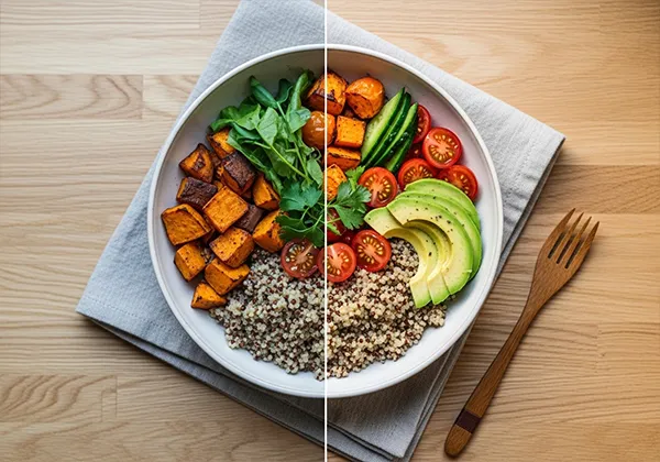
White balance is the first decision that shapes every other color in your edit. Get it wrong and no amount of HSL work downstream will fully rescue it. The most common version of this mistake is going too cool – photographers often associate a slightly blue, neutral tone with “clean” or “professional,” but on food it reads as cold, sterile, and unappetizing.
Warm tones – ambers, golden yellows, soft oranges – are psychologically linked to cooking, fire, and freshness. They trigger appetite in a way that cooler tones simply don’t. When you strip that warmth out of a croissant, a roasted vegetable, or a bowl of pasta, the dish loses its pull before the viewer even consciously registers why.
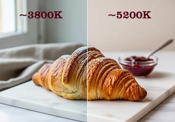
| Food type | Ideal temp range | Tint direction |
| Bread, pastries, baked goods | 5000K–5500K | Slight magenta +3 to +5 |
| Raw salads, green dishes | 4800K–5200K | Neutral to slight green 0 to -3 |
| Meat, grilled proteins | 5200K–5800K | Magenta +4 to +8 |
| Dairy, light sauces | 4600K–5000K | Neutral |
| Dark dishes (chocolate, coffee) | 5000K–5400K | Slight magenta +2 to +4 |
This one trips up a lot of people because the instinct makes sense. The salad looks dull, so you drag the Saturation slider up. But what you get is rarely what you wanted – either the greens go neon and unreal, or they shift into a murky olive that looks more overcooked than fresh.
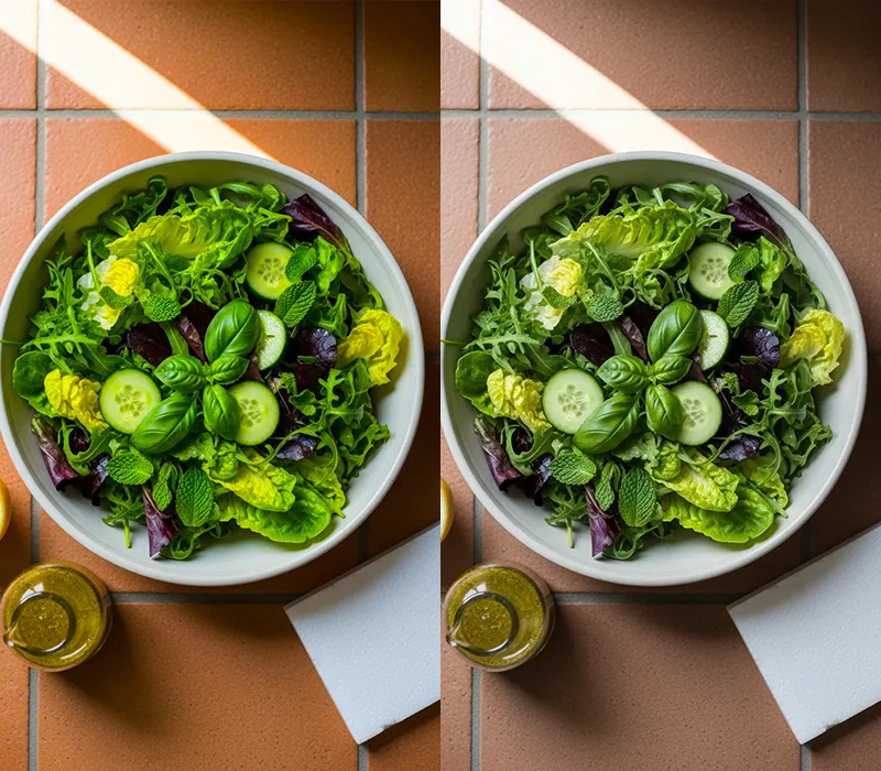
The reason is that the Saturation slider in Lightroom is completely global. It treats the green in your herbs exactly the same as the green in a background prop or a tinted shadow. The fix is the HSL panel (called Color Mix in Lightroom Mobile), where you can target just the hues you need.
After editing hundreds of food shoots, I’ve found there’s a specific hue range where greens read as “fresh” rather than “overcooked.” I call it the appetite hue window: roughly 110° to 145° in the green spectrum.
Push the Hue slider slightly cooler (toward teal, -5 to -10) and greens fall into that window. Go warmer and they slide toward yellow-green, which reads as wilted. This is not something most Lightroom tutorials talk about, but it changes everything for green-heavy dishes like salads, herb garnishes, and avocado.
For dishes like avocado toast, pesto pasta, or herb-heavy plates, you can also add a slight Tone Curve pull on the green channel – a gentle S-curve there lifts the midtones in the green channel without touching red or blue, giving you clean, vivid color that still looks like real food.
Meat is one of the hardest subjects to edit well in Lightroom because it lives in a very narrow color range. The difference between a beautiful, caramelised sear and a grey, unappetizing slab often comes down to just a few points of red and orange saturation. And it’s easy to lose those points without even noticing.
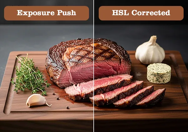
The usual culprit is a global exposure or shadow adjustment. When you lift shadows across the whole image to reveal detail in the background, you’re diluting the deep reds and browns in the protein at the same time. Chicken looks anaemic, beef looks grey, and pork loses all its roasted warmth.
I ruined a full rack of ribs on a client shoot doing exactly this – one global exposure push of +0.7 and all that caramelised bark color was gone. What fixed it wasn’t undoing the exposure. It was going straight to HSL and pulling Red Saturation up to +22 and Orange Saturation to +18. The ribs looked like ribs again in about 90 seconds.
A collection of food presets for Lightroom can be a reliable shortcut here – good food presets are built with these red and orange channel values already dialed in, so you’re not starting from a neutral base every time.
A collection of food presets for Lightroom can be a reliable shortcut here – good food presets are built with these red and orange channel values already dialed in, so you’re not starting from a neutral base every time.
There’s a trend in food photography editing toward dark, moody aesthetics – and done well, it looks great. Done badly, it looks like the food is sitting in a cave. The specific problem is dragging the Blacks slider too far left, or pulling the bottom-left point of the Tone Curve too hard. The shadows become pure black, and all the texture that was living in them disappears.
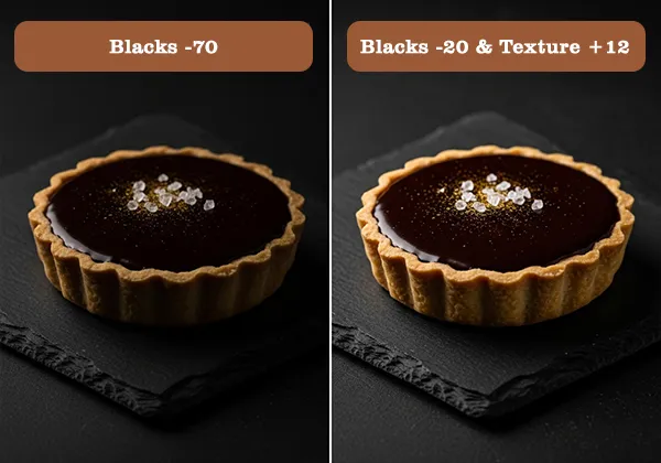
Texture is the whole point. The pores in dark bread, the crust on a chocolate tart, the crema on an espresso – these are the details that make food feel real and edible. Crush the blacks and you’re left with a flat, heavy silhouette where interesting food used to be.
Whether you prefer a Moody aesthetic or a Light and Airy look, your editing process in Lightroom remains the foundation of your final edit.
Most Lightroom food tutorials tell you to push blacks for “moodiness.” I stopped doing that two years ago. Moodiness comes from controlled light ratios at the shoot, not from obliterating shadow detail in post.
When you crush blacks in editing, you’re not creating drama – you’re hiding information. Keep your blacks above 15 on the histogram and use lighting to create the mood instead.
Clarity is a midtone contrast slider. What it actually does is increase local contrast around edges – which sounds useful until you apply it globally to food. Suddenly the soft skin of a peach has a crunchy halo. The surface of a sauce looks like it was rendered in a video game. Cheese gets a weird gritty texture that reads as mould rather than aged rind.
The Texture slider (available since Lightroom CC 2019) does a similar job at a finer scale and is almost always the better choice for food. It affects fine surface detail without the harsh midtone punch that makes food look processed.
On a shoot for a restaurant client, I’d been using global Clarity +35 as part of my standard food preset. The client kept asking for revisions – something felt “artificial” but they couldn’t name it. Switching to Texture +18 applied globally, with Clarity used only via brush on the pasta edges at +12, dropped their revision requests from six rounds to one. Same dish, same light, completely different feel.
Quick-reference table
| Mistake | Lightroom tool | Fix value / direction |
| Wrong white balance | Temp slider + Tint | 4800K–5500K; Tint +3 to +6 magenta |
| Flat, muddy greens | HSL Green/Yellow Hue + Luminance + Saturation | Hue -5 to -10; Lum +8 to +15; Sat +10 to +20 |
| Grey meat | HSL Red/Orange Saturation + Tone Curve red channel | Red Sat +15 to +25; Orange Sat +10 to +20; Curve midtone lift +5 to +8 |
| Crushed blacks | Blacks slider + Tone Curve bottom-left point | Keep blacks above 15; lift curve point 5–10pts off corner |
| Plastic clarity | Texture (global) + Clarity (local brush only) | Texture +10 to +20 global; Clarity +10 to +20 local on crispy elements only |
Start with white balance between 4800K and 5500K, then work through the HSL panel to target specific food colors rather than using global Saturation. For most dishes, use Texture instead of Clarity, keep blacks above 15 on the histogram, and only apply Clarity locally on elements with crispy or rough surfaces. A good workflow goes: white balance first, exposure second, HSL color corrections third, local adjustments last.
Usually because a global exposure or shadow lift has diluted the reds and oranges that give meat its warm, cooked color. The fix is to go into the HSL panel and boost Red Saturation (+15 to +25) and Orange Saturation (+10 to +20). If the meat still looks flat, pull up the red channel in the Tone Curve at the midtone point. Avoid using Vibrance to solve this – it doesn’t target reds effectively because they’re already among the more saturated tones in the image.
Skip the global Saturation slider and go straight to the HSL panel. In the Hue tab, shift Green between -5 and -10 to move into what I call the appetite hue window – the range where greens read as fresh rather than overcooked. Then lift Green Luminance by +8 to +15, and finally add Green Saturation gradually. Use the target selector tool to click directly on the vegetable and drag upward – Lightroom will automatically adjust the exact channels that affect that area.
Texture for almost everything. Clarity applies broad midtone contrast that makes most food surfaces look harsh and artificial when used globally. Texture works at a finer scale and adds surface definition without the plastic effect. The exception is specific elements with genuinely crispy or rough surfaces – bread crust, fried chicken skin, seeds – where a low local Clarity value (+10 to +20 via brush) is appropriate. For soft foods like burrata, cream, or mousse, try light negative Clarity (-5 to -10) to keep them looking naturally soft.
There’s no single universal setting, but 4800K to 5500K covers the majority of food shot in natural or soft artificial light. Baked goods and grilled proteins tend to look best at the warmer end (5200K–5500K), while salads and light dairy dishes suit the cooler end (4800K–5000K). Always pair your Temp adjustment with a small Tint check – a slight magenta push (+3 to +6) restores warmth that the temperature slider alone sometimes misses, especially under LED lighting.
If you’d rather not build these color corrections from scratch every time, a well-built preset gives you the HSL values, white balance starting point, and tone curve adjustments already dialed in for food. Grab a collection of food presets for Lightroom built specifically around the color challenges covered in this article – and spend more time shooting, less time fixing.
If you’d rather not build these color corrections from scratch every time, a well-built preset gives you the HSL values, white balance starting point, and tone curve adjustments already dialed in for food. Grab a collection of food presets for Lightroom built specifically around the color challenges covered in this article – and spend more time shooting, less time fixing.